

Pasta Rico B2B App
Pasta Rico B2B App
A custom B2B web app built for Pasta Rico, designed to simplify bulk ordering and streamline the customer experience. from product selection to checkout.
A custom B2B web app built for Pasta Rico, designed to simplify bulk ordering and streamline the customer experience. from product selection to checkout.
For the best experience, open on desktop
Client :
Client :
Pasta Rico
Pasta Rico
Tools :
Tools :
Figma & Adobe Photoshop
Figma & Adobe Photoshop
Rule :
Rule :
Product Designer
Product Designer
Timeline :
Timeline :
March 2025
March 2025
About the app
About the app
Pasta Rico’s B2B web application was built to simplify the ordering process for business clients. The platform allows restaurants, hotels, and catering services to easily browse available products, place bulk orders, and manage their purchasing, all in one streamlined interface.
Pasta Rico’s B2B web application was built to simplify the ordering process for business clients. The platform allows restaurants, hotels, and catering services to easily browse available products, place bulk orders, and manage their purchasing, all in one streamlined interface.
The goal was to create an efficient, user friendly system tailored specifically to the company’s operational needs and customer behavior.
The goal was to create an efficient, user friendly system tailored specifically to the company’s operational needs and customer behavior.

My rule
My rule
As the solo Product Designer on this project, I was responsible for the entire UX and UI process — from defining user needs and mapping flows, to designing high-fidelity screens and ensuring a smooth, intuitive experience.
As the solo Product Designer on this project, I was responsible for the entire UX and UI process — from defining user needs and mapping flows, to designing high-fidelity screens and ensuring a smooth, intuitive experience.
Working closely with the team at Dolimo, I planned, designed, and shaped the project end to end.
Working closely with the team at Dolimo, I planned, designed, and shaped the project end to end.
The main challege
The main challege
Business clients needed a fast, intuitive way to place bulk orders, often involving dozens of items and multiple types of orders. The challenge was to design a clear and efficient flow where every possible action is accessible and easy to understand.
Business clients needed a fast, intuitive way to place bulk orders, often involving dozens of items and multiple types of orders. The challenge was to design a clear and efficient flow where every possible action is accessible and easy to understand.
Research
Research
To design a flow that truly supports fast and efficient ordering, I conducted focused research into how business clients interact with the platform in real time. The goal was to identify where the process becomes slow or unclear, and what steps interrupt the natural flow of completing an order.
To design a flow that truly supports fast and efficient ordering, I conducted focused research into how business clients interact with the platform in real time. The goal was to identify where the process becomes slow or unclear, and what steps interrupt the natural flow of completing an order.
I mapped user actions across different order scenarios. including repeated orders, product selection, and additional requests, while paying close attention to points of friction and missing functionality.
I mapped user actions across different order scenarios. including repeated orders, product selection, and additional requests, while paying close attention to points of friction and missing functionality.

Key insights
Key insights
Repeated orders need to be faster
Repeated orders need to be faster
Many users place the same order repeatedly, so the system must support that behavior efficiently. Creating a quick and intuitive way to reorder is essential for saving time and reducing friction.
Many users place the same order repeatedly, so the system must support that behavior efficiently. Creating a quick and intuitive way to reorder is essential for saving time and reducing friction.
Similar actions require unified behavior
Similar actions require unified behavior
Even when users perform different types of orders, the experience should remain consistent. The interface needs to simplify these variations into one clear, predictable flow.
Even when users perform different types of orders, the experience should remain consistent. The interface needs to simplify these variations into one clear, predictable flow.
The Solution
The Solution
The solution was to create a clear, action-oriented interface where all order types and actions are accessible within a single, organized screen. This structure keeps users focused, reduces friction, and allows for fast, intuitive completion of both simple and complex orders.
The solution was to create a clear, action-oriented interface where all order types and actions are accessible within a single, organized screen. This structure keeps users focused, reduces friction, and allows for fast, intuitive completion of both simple and complex orders.
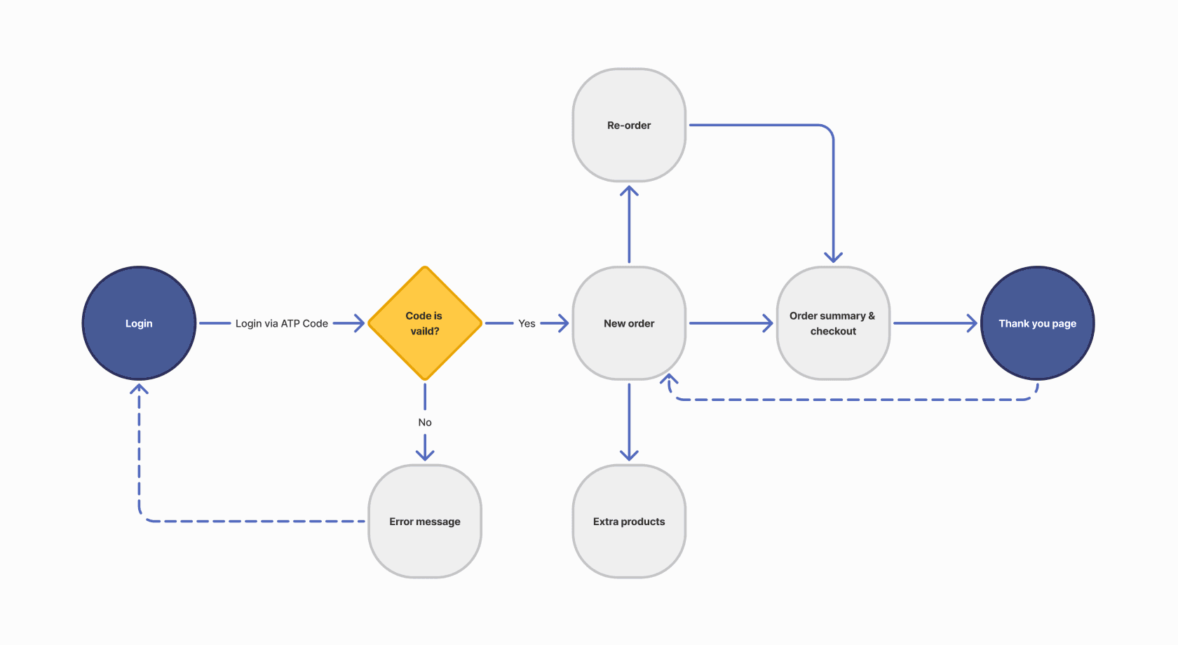
User flow
User flow
I designed the user flow to be as simple and accessible as possible, making sure each step in the ordering process feels clear, focused, and easy to complete.
I designed the user flow to be as simple and accessible as possible, making sure each step in the ordering process feels clear, focused, and easy to complete.
Visual Design
Visual Design
The final screens of the app, showcasing the complete visual design.
The final screens of the app, showcasing the complete visual design.
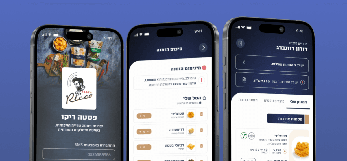
Login with OTP
Login with OTP
During the research phase, I focused on understanding why users were struggling to complete their orders.
During the research phase, I focused on understanding why users were struggling to complete their orders.
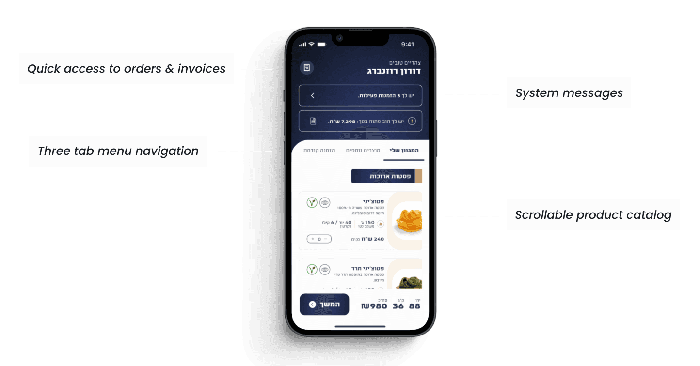
Orders & Invoices
Orders & Invoices
From the home screen, users can quickly access their past orders and download invoices.
From the home screen, users can quickly access their past orders and download invoices.
Home Screen Navigation
Home Screen Navigation
Three tabs make ordering simple, all using the same clean scrollable layout.
Three tabs make ordering simple, all using the same clean scrollable layout.
Checkout & Confirmation
Checkout & Confirmation
A focused checkout experience that allows users to review their order, and reach a clear confirmation screen.
A focused checkout experience that allows users to review their order, and reach a clear confirmation screen.
Final Prototype
Final Prototype
showcasing the full ordering experience from start to finish.
showcasing the full ordering experience from start to finish.
More projects
More projects

Cemada Production Dashboard
Cemada Production Dashboard
Cemada Production Dashboard

Preflop Master Gaming App
Preflop Master Gaming App
Preflop Master Gaming App
Lets Talk
054-2343448
Galtamir15@gmail.com
© Gal Tamir 2025