
Chemada Production Dashboard
Chemada Production Dashboard
Chemada Production Dashboard
A custom internal dashboard designed for Chemada Industries production floor. Supporting daily operations with a clear structure and user friendly experience.
A custom internal dashboard designed for Chemada Industries production floor. Supporting daily operations with a clear structure and user friendly experience.
For the best experience, open on desktop
Client :
Cemada Industries LTD
Tools :
Figma
Rule :
Product Designer
Timeline :
April 2025
Client :
Cemada Industries LTD
Tools :
Figma
Rule :
Product Designer
Timeline :
April 2025
About the app
About the app
Chemada’s internal dashboard was built to support daily operations on the production floor. The system is fully tailored to the company’s unique workflow and provides employees with a clear, structured interface to carry out their tasks efficiently.
Chemada’s internal dashboard was built to support daily operations on the production floor. The system is fully tailored to the company’s unique workflow and provides employees with a clear, structured interface to carry out their tasks efficiently.
Since the system is inherently complex, the goal was to design it in a way that is comfortable and user friendly making operation easier without compromising the required functionality.
Since the system is inherently complex, the goal was to design it in a way that is comfortable and user friendly making operation easier without compromising the required functionality.

My rule
My rule
As the only Product Designer on the project, I was in charge of shaping both the user experience and the visual design, from defining user needs to building clear task focused flows.
As the only Product Designer on the project, I was in charge of shaping both the user experience and the visual design, from defining user needs to building clear task focused flows.
Working closely with the team at Dolimo, I planned, designed, and shaped the project end to end.
Working closely with the team at Dolimo, I planned, designed, and shaped the project end to end.
The main challege
The main challege
The challenge was to design an interface that prevents confusion and supports clear decision-making. Although the system includes functions with entirely different goals, the user’s interaction with them feels similar. since the actions within each function follow a very similar structure, which can easily lead to misunderstanding.
The challenge was to design an interface that prevents confusion and supports clear decision-making. Although the system includes functions with entirely different goals, the user’s interaction with them feels similar. since the actions within each function follow a very similar structure, which can easily lead to misunderstanding.
Research
Research
The main focus of my research was to understand the best way to distinguish between the system’s core functions, so that users always know exactly where they are and what they’re working on, without getting confused.
The main focus of my research was to understand the best way to distinguish between the system’s core functions, so that users always know exactly where they are and what they’re working on, without getting confused.
Given the structure of the system, the system includes three core functions, each responsible for a completely different task and outcome. yet the way users interact with them often looks and feels similar, which can easily lead to confusion.
Given the structure of the system, the system includes three core functions, each responsible for a completely different task and outcome. yet the way users interact with them often looks and feels similar, which can easily lead to confusion.
This created a unique tension:
the interface needed to clearly distinguish between functions, while still maintaining visual and behavioral consistency to avoid user confusion.
This created a unique tension:
the interface needed to clearly distinguish between functions, while still maintaining visual and behavioral consistency to avoid user confusion.
Key insights
Key insights
Clear separation between core functions
Clear separation between core functions
Users need to immediately recognize which function they’re in. I need to crate a strong separation between the three core functions.
Users need to immediately recognize which function they’re in. I need to crate a strong separation between the three core functions.
Consistent Layout with Visual Separation
Consistent Layout with Visual Separation
In areas where interface patterns are looking similar, keeping a consistant layout will supports usability. So its mean the separation should come from distinct visual cues that clearly define the context of each function, without disrupting the overall layout.
In areas where interface patterns are looking similar, keeping a consistant layout will supports usability. So its mean the separation should come from distinct visual cues that clearly define the context of each function, without disrupting the overall layout.
The Solution
The Solution
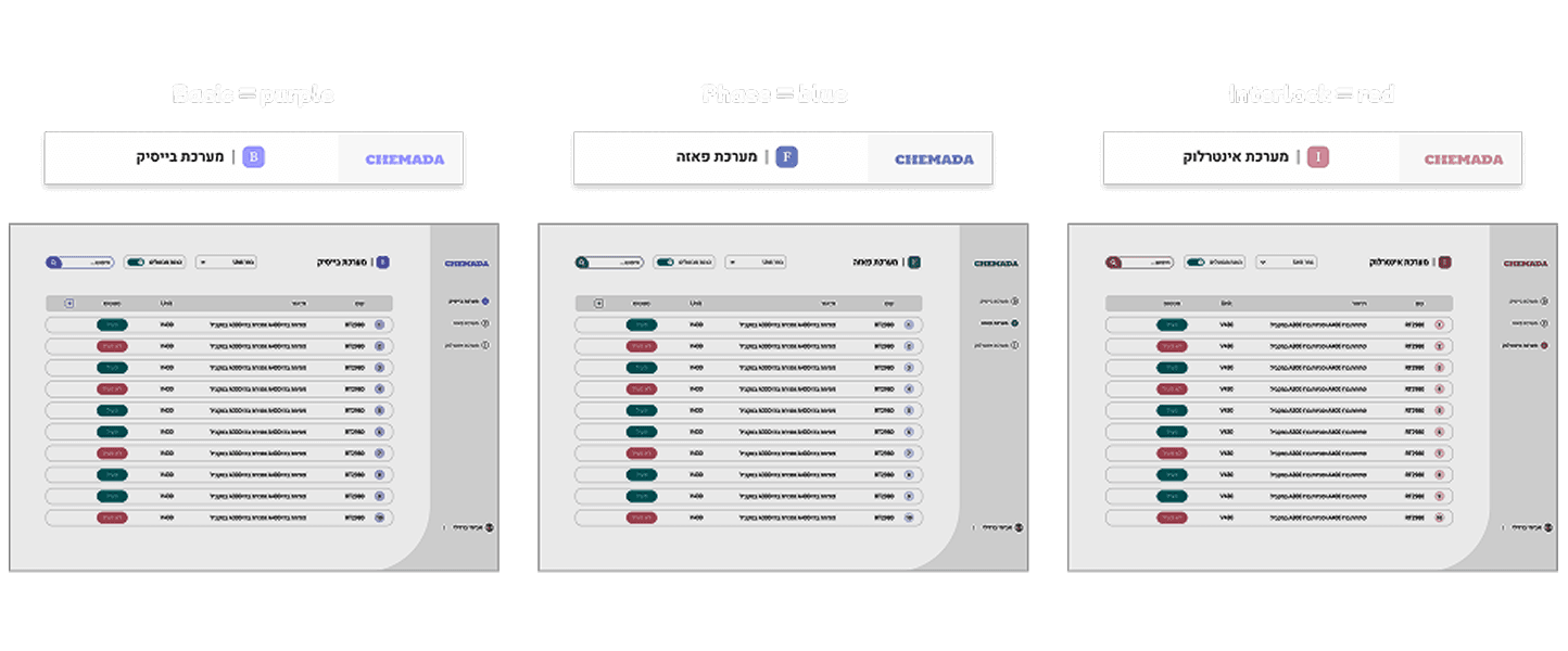
To solve the problem, I created a clear visual separation between the three core functions by assigning each one its own color and icon. At the same time, I kept the layout consistent across the system. Helping the users feel familiar with the interface while they always knowing exactly where they are and what they're working on.
To solve the problem, I created a clear visual separation between the three core functions by assigning each one its own color and icon. At the same time, I kept the layout consistent across the system. Helping the users feel familiar with the interface while they always knowing exactly where they are and what they're working on.
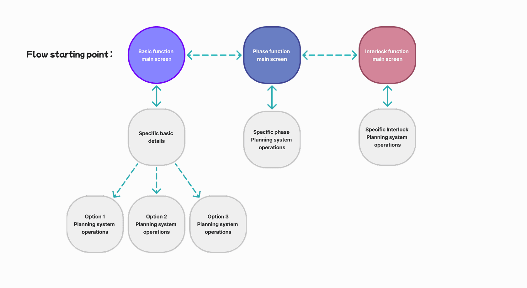
User flow
User flow
I designed the user flow to make navigation between the system’s core functions as clear and intuitive as possible, so the users can complete their tasks quickly, without hesitation or confusion.
I designed the user flow to make navigation between the system’s core functions as clear and intuitive as possible, so the users can complete their tasks quickly, without hesitation or confusion.
Visual Design
Visual Design
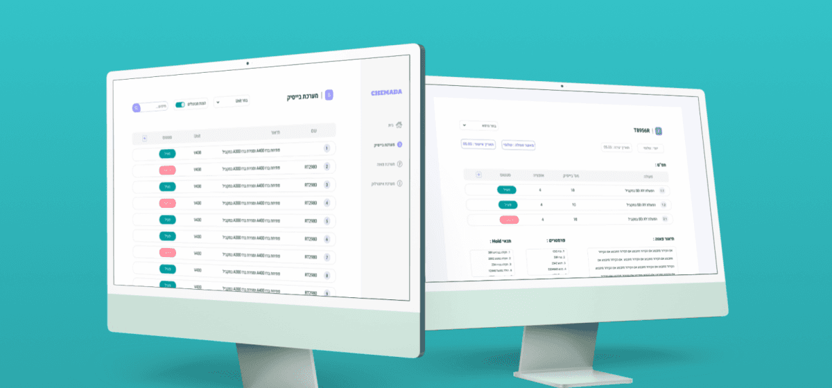
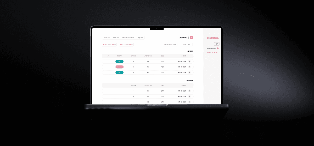
The final screens of the dashboard.
The final screens of the dashboard.
Function Switching
Function Switching
Users can easily switch between the three core functions: Basic, Phase, and Interlock — each with her own color and icon.
Users can easily switch between the three core functions: Basic, Phase, and Interlock — each with her own color and icon.
Basic function flow
Basic function flow
The first and main function, basic function and her user flow.
The first and main function, basic function and her user flow.
Phase function flow
Phase function flow
The second function, phase function and her user flow.
The second function, phase function and her user flow.
Interlock function flow
Interlock function flow
The third function, interlock function and her user flow.
The third function, interlock function and her user flow.
More projects
More projects

Preflop Master Gaming App
Preflop Master Gaming App
Preflop Master Gaming App

Lets Talk
054-2343448
Galtamir15@gmail.com
© Gal Tamir 2025